Neurapix

Welcome to Article 2 of our two-part series on signature photography editing styles. In Article 1, we established the foundation by defining your "why," outlining core, technical, and emotional anchors, and setting up a consistent Lightroom editing workflow with “80%” base presets and AI SmartPresets. Now, it’s time to get hands-on and explore the techniques that will help you perfect your photo editing style.
In this article, we’ll guide you through five of the most popular photo editing styles—Light & Airy, Dark & Moody, Film-Look (Analog Emulation), Editorial & High-Fashion, and Vibrant & Bold—with detailed, step-by-step Lightroom Classic recipes. For each style, you’ll learn:
Emotional goals & ideal subjects: which genres (e.g., weddings, newborns, sports) benefit the most
Exact slider settings in the Basic, Tone Curve, HSL/Color, Color Grading, and Effects panels
Example SmartPresets from Neurapix’s store to jump-start your own versions
By the end of this article, you’ll have concrete, repeatable workflows for trending photo editing styles, eliminating the guesswork when it comes to mastering specific styles, such as wedding photography or any other shoot.
Light & Airy style
The Light & Airy style conveys joy, softness, and ethereal luminosity. This style is particularly popular among photographers who specialize in weddings, engagements, family portraits, and newborn shoots. It’s perfect for anyone looking to infuse their images with brightness, romance, and a fine-art inspired, almost dreamlike quality.
The goal of this style is to create an atmosphere of lightness and serenity. The images evoke feelings of warmth, innocence, and elegance, making it ideal for shoots with intimate or celebratory themes, such as weddings or family moments.
Step-by-step Lightroom recipe
Basic Panel
Exposure: +0.5 to +1.0 (lift midtones)
Contrast: -10 to -20 (keep shadows soft)
Highlights: -30 (preserve bright details)
Shadows: +30 (open up darker areas)
Whites/Blacks: Whites +10, Blacks +5 (gentle tonal compression)
Temp/Tint: Temp +150–+300 K (warm), Tint +5 (subtle magenta)
Tone Curve
Lift the leftmost (black) point to around 10 RGB for a matte haze
Apply a gentle S-curve: pull down ~10 in the lower-mid section and push up ~10 in the upper-mid section for soft contrast
HSL/Color Panel
Hue: Greens → -10 (toward yellow), Oranges → +5 (richer skin tones)
Saturation: Greens -20, Blues -15, Oranges +10, Reds +5
Luminance: Greens +10, Blues +5, Oranges +15
Color Grading
Highlights: add a touch of warm orange (Hue ~50°, Sat ~10)
Shadows: add subtle pink/purple (Hue ~320°, Sat ~5)
Midtones: leave neutral or lift slightly toward warm (Hue ~40°, Sat ~3)
Effects
Clarity: -10 (dreamy glow)
Texture: -5 (additional softness)
Grain: Amount 10, Size 25, Roughness 50 (optional fine film grain)
Post-Crop Vignette: +10 (white) or -5 (soft dark)
Finishing touches
Inspect skin tones at 100% to ensure they remain natural.
Use an Adjustment Brush with +10 Exposure and +5 Clarity to subtly highlight faces or details.
SmartPresets to try:
Stefano Casati "Tuscany Wedding Light & Airy" – This preset mimics the classic Fuji 400H film look, known for its soft pastel greens and warm, elegant whites. It’s perfect for wedding photography, creating a gentle, romantic atmosphere while maintaining the natural colors of the scene.
Céline Chhuon "Bright & Airy Fine Art" – This preset enhances creamy skin tones and offers subtle, balanced contrast. The look is soft, with a fine grain that gives a dreamy, artistic effect. Ideal for fine art or portrait photography, it creates images that exude both clarity and a light, ethereal quality.

Photo: Formaphotography
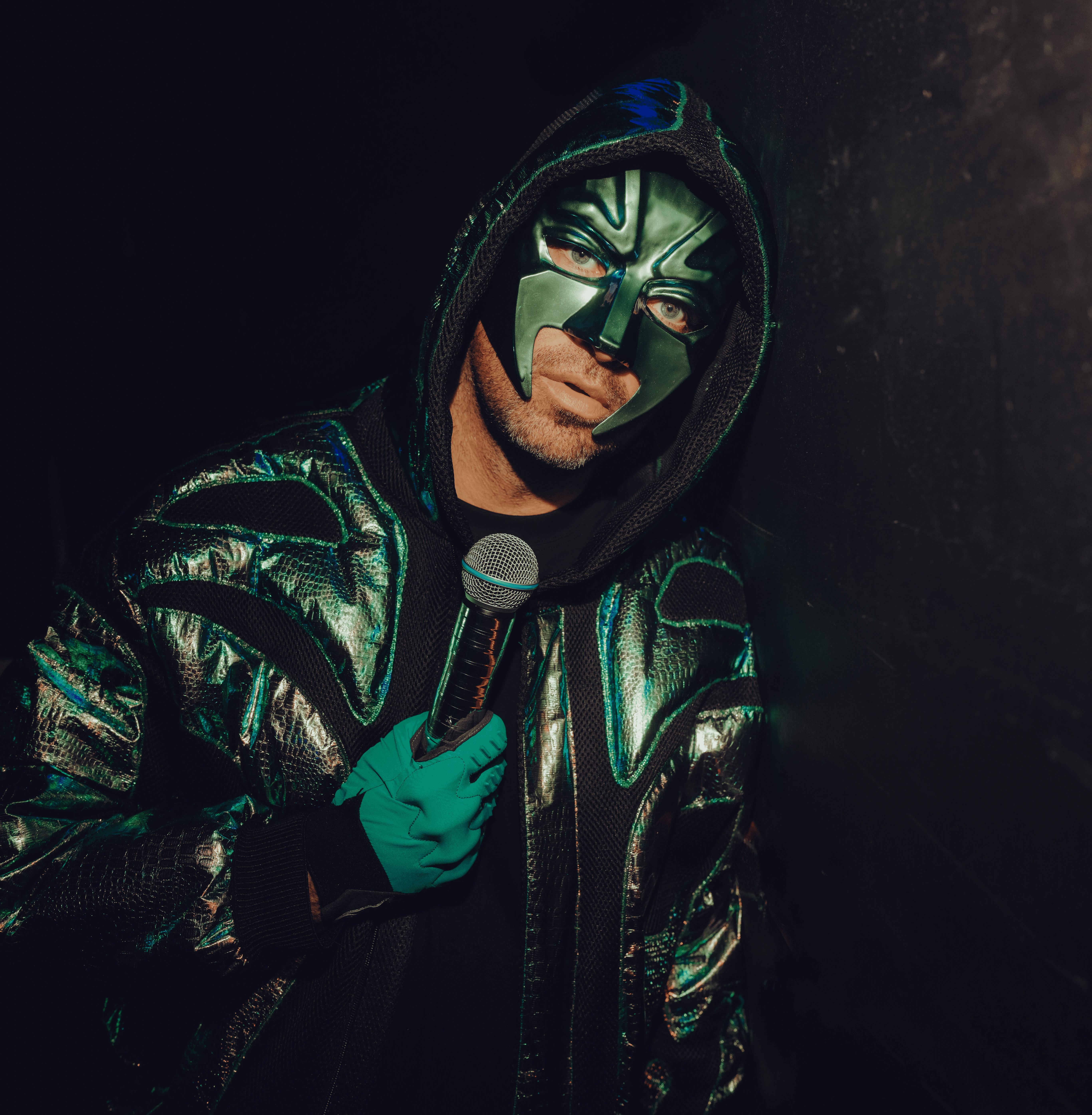
Dark & Moody style
The Dark & Moody style emphasizes drama, intimacy, and depth. This style is perfect for elopements, editorial boudoir, evening receptions, or any photo session where you want a cinematic, soulful feel.
This editing style creates an atmosphere of mystery and allure, often highlighting rich colors and shadows to add visual impact and convey intense emotions. It's ideal for clients who want to evoke deep, emotive tones in their images.
Step-by-step Lightroom recipe
Basic Panel
Exposure: -0.3 to -0.5 (deepen overall tonality)
Contrast: +10 (define midtones)
Highlights: -20 (tame bright areas)
Shadows: -10 (retain some detail)
Blacks: -20 to -30 (true black points)
Whites: 0 or -5 (depending on scene)
Temp/Tint: Temp +100 K (slight warmth) or Temp -100 K + Tint +10 (cool tone)
Tone Curve
Point Curve: create a strong S-curve—lift blacks slightly (~5), dip shadows (~10), lift highlights (~10)
HSL/Color Panel
Hue: Greens → -15 (olive), Blues → +10 (teal shift)
Saturation: Greens -25, Blues -20, Oranges +5
Luminance: Oranges +10, Reds +5
Color Grading
Shadows: warm amber (Hue ~40°, Sat ~15)
Highlights: cool teal (Hue ~200°, Sat ~10)
Midtones: Hue ~40°, Sat ~5
Effects
Clarity: +15 to +20 (punch and detail)
Dehaze: +10 (atmospheric density)
Grain: Amount 20, Size 20, Roughness 40 (optional)
Vignette: -15 (draw focus inward)
Finishing touches
Use a Radial Filter around your subject with +10 Exposure and +10 Clarity to sculpt the light.
Check shadow detail at 1:1; recover if too crushed.

Photo: Formaphotography
Film-Look (Analog Film-Inspired style)
The Film-Look style mimics classic analog film stocks—such as Kodak Portra’s warm skin tones, Fuji 400H’s pastel greens, and Ilford’s creamy B&W grain. It’s adored in fine-art weddings, editorial shoots, and any project where nostalgia and timelessness are key elements.
This style is perfect when you want to create a sense of warmth and nostalgia while maintaining a clean, soft aesthetic in your photos.
Step-by-step Lightroom recipe
Basic Panel
Exposure/Contrast: moderate (+0.2 Exposure, +5 Contrast)
Highlights: -15 for gentle roll-off
Shadows: +15 for open blacks
Whites: +5, Blacks: +10
Tone Curve
Lift the blacks to ~20 RGB, then apply a mild S-curve—shadows -10, highlights +10
Camera Calibration
Red Primary Hue: +5, Red Primary Sat: +10
Blue Primary Hue: -10, Blue Primary Sat: +15
HSL/Color Panel
Saturation: Vibrance -10, Greens -15, Blues -10, Oranges +5
Hue: Greens +5, Blues -5
Luminance: Oranges +10, Reds +5
Effects
Grain: Amount 20–30, Size 25, Roughness 50
Clarity: -5
Vignette: -10
Finishing touches
Switch to Black & White mode and adjust the B&W Mix: Reds +20, Greens -10, Blues -20 for a more classic look. Maintain grain, but reduce Clarity to -10.
SmartPresets to try:
Christophe Serrano "Film Fine-Art Wedding" – This preset emulates the iconic Kodak Portra 400 film, known for its warm highlights and rich, dense blues. It brings a timeless, film-inspired aesthetic to your wedding photography, perfect for capturing soft, natural skin tones with a touch of nostalgic charm.
Stefano Casati "Tuscany Wedding Light & Airy" (Film Mode) – This preset captures the delicate pastel tonality of Fuji 400H film, combined with a subtle film grain. It’s ideal for creating soft, dreamy wedding photos that maintain a light, airy feel while adding a touch of vintage film warmth to the images.

Photo: Formaphotography
Editorial & High-Fashion style
The Editorial & High-Fashion styles of photo editing channel the clean, cohesive, and color-accurate look of magazine spreads. This style is ideal for branding, business portraits, styled shoots, and any project that needs images to appear ready for print.
It is perfect for fashion, commercial, and corporate photography where color precision, sharpness, and clarity are crucial. This style creates a polished, high-end finish suitable for professional and editorial use.
Step-by-step Lightroom recipe
Basic Panel
White Balance: Eyedropper on neutral gray card
Exposure: +0.3
Contrast: +15
Highlights: -10, Shadows: +10
Whites: +5, Blacks: -5
Tone Curve
Parametric Curve: Lights +10, Darks -10
Point Curve: optional slight S-curve (+5 shadows, +5 highlights)
HSL/Color Panel
Hue: keep primary hues natural; adjust only if brand-specific
Saturation: -5 overall
Luminance: Oranges +10, Blues +5, Greens +5
Color Grading
Neutral midtone lift (Hue 0°, Sat 3)
Avoid strong tints
Effects
Clarity: +10
Texture: +5
Spot Removal & Brushes: -10 Texture on skin, dodge & burn
Vignette: -3
Finishing touches
Zoom to 100% on eyes or product details—apply fine spot-removal or sharpening.
Ensure identical WB and curves across the set.
SmartPresets to try:
Béatrice de Guigne "Be Timeless" – This preset enhances natural colors with a fashion-inspired tonal lift, giving your images a polished and sophisticated look. It’s perfect for creating elegant, timeless photographs that retain their authenticity while adding a modern, high-end feel, ideal for portrait or editorial shoots.
Nils Hasenau "Business Pro" – This preset automatically balances white balance to ensure harmony across your images while delivering polished, true-to-life skin tones. It’s designed to bring a professional, consistent look to business portraits, headshots, and corporate photography, ensuring your images are both realistic and refined.

Photo: Formaphotography
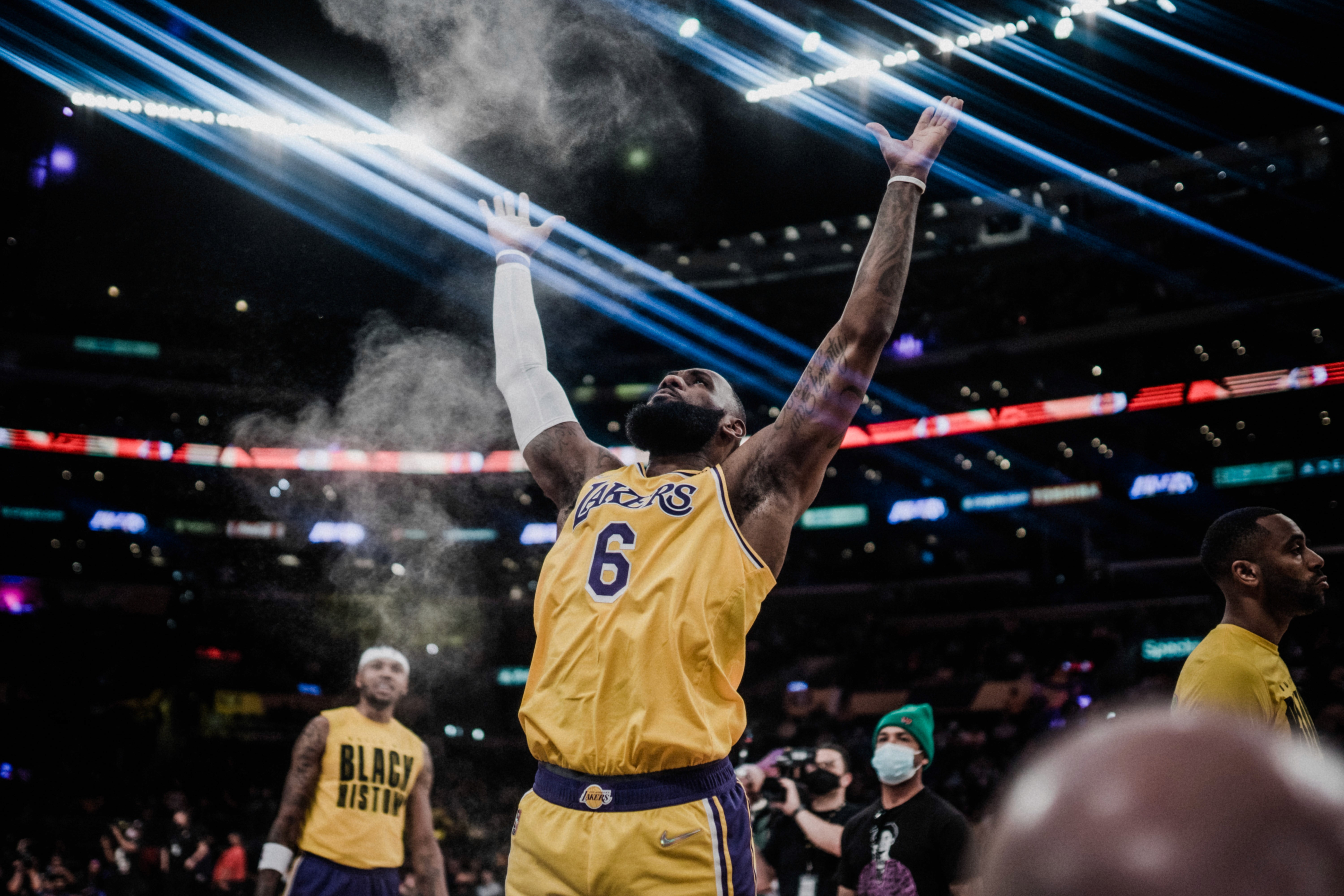
Vibrant & Bold (High-Pop) style
The Vibrant & Bold style of photo editing brings energy and punch to your images, making them pop with color and contrast. This style is ideal for sports action, concert photography, dance performances, or any shoot where you want your colors and contrast to stand out.
It’s perfect for high-energy subjects that need a dramatic, eye-catching appearance, ideal for commercial photography, or dynamic scenes that require intense colors and bold contrasts.
Step-by-step Lightroom recipe
Basic Panel
Contrast: +20, Exposure: +0.3
Whites: +10, Blacks: -10
Highlights: 0 or +5, Shadows: +10
Tone Curve
S-curve: shadows -15, highlights +15
HSL/Color Panel
Vibrance: +30, Saturation: +10
Blue Sat: +20, Red Sat: +15, Orange Sat: -5
Green Sat: -10, Green Hue: -5
Color Grading (Optional)
Shadows: Hue 220°, Sat 10, Highlights: Hue 40°, Sat 5
Effects
Clarity: +20, Texture: +10, Grain: 5–10, Vignette: -5
Local adjustments
Brush: +0.5 Exposure, +10 Clarity on faces or jerseys
SmartPreset to try:
Kay-Uwe Fischer "Concerts" – This preset enhances your images with mega-bright highlights and vibrant skin tones, making it perfect for capturing the energy of concerts and live performances. It brings out the intensity of colored lighting, ensuring that every moment feels dynamic and full of life, while maintaining rich, natural-looking skin tones.

Photo: Anne Ehrler
Soft Pastel & Vintage (Matte) style
The Soft Pastel & Vintage style evokes nostalgia, whimsy, and sweetness. It’s ideal for maternity shoots, springtime portraits, baby milestones, or retro-styled sessions.
This style creates a sense of warmth, innocence, and timelessness, perfect for softer, dreamier themes and capturing the sweetness of childhood or vintage-inspired looks.
Step-by-step Lightroom recipe
Basic Panel
Exposure: +0.2, Contrast: -10
Whites: +5, Blacks: +15
Highlights: -20, Shadows: +20
Temp: +300 K, Tint: +10
Tone Curve
Point Curve: black point ~30 RGB; flatten mid; lower top to ~240 RGB
HSL/Color Panel
Vibrance/Saturation: -15
Purple Sat: +10, Aqua Sat: +10, Blue Sat: -20, Green Sat: -25
Green Hue: +5, Blue Hue: +10
Color Grading
Highlights: Hue 30°, Sat 15
Shadows: Hue 200°, Sat 10
Midtones: Hue 30°, Sat 5
Effects
Clarity: -10
Grain: Amount 20, Size 30, Roughness 60
Vignette: -10
Finishing touches
Radial Filter: -20 Clarity, +0.3 Exposure
SmartPresets to try:
Neurapix "Vintage Sunbeam" – This preset evokes the feel of warm, faded sunlight with soft, matte shadows, creating a nostalgic, sun-drenched look. It’s perfect for adding a dreamy, vintage atmosphere to your images, ideal for portraits, outdoor shoots, or any project that benefits from a soft, retro vibe.
Neurapix "Gentle Mist" – This preset enhances your images with delicate, rosy highlights and a subtle film-like grain, giving them a soft, ethereal quality. It’s perfect for creating a tranquil, almost surreal mood, ideal for fine art photography or portrait sessions that require a gentle, timeless touch.

Photo: Formaphotography
Consistent Natural style
Sometimes the most compelling edit style is the one you don’t notice. The Consistent Natural style delivers true-to-life colors and balanced contrast—perfect for corporate headshots, product photography, real-estate interiors, and documentary work where authenticity is paramount.
This style focuses on preserving the natural integrity of the scene, making sure the final image reflects the true colors and contrast without the editing standing out.
Step-by-step Lightroom recipe
Basic Panel
Neutral WB via Gray Card
Exposure: +0.3, Contrast: +5, Highlights: -10, Shadows: +10, Whites: +5, Blacks: -5
Tone Curve
Mild S-curve: shadows +5, midtones +5, highlights +5
HSL/Color Panel
Vibrance: +5, Saturation: 0 (adjust only to correct extremes)
Effects
Clarity: +5, Texture: +5, Grain: 0, Vignette: 0
Workflow tips
Batch-sync WB per lighting
Uniform look without shouting “this is an edit”
SmartPreset to try:
Nils Hasenau "Business Pro" – This preset offers automatic white balance optimization, ensuring consistency across all your images. It delivers polished, true-to-life skin tones, making it perfect for corporate headshots, business portraits, and professional photo shoots that require a clean, reliable look at scale.

Photo: Formaphotography
Putting it all together
With these detailed recipes, you now have the tools to select or blend photo editing styles based on any project or client. For example, for luxury weddings, you can choose the Film-Look or Light & Airy style, while for sports photography, Vibrant & Bold is ideal to make those action shots pop.
You can also experiment with hybrid approaches, such as combining the Film-Look curves with Soft Pastel colors, or adding a Vibrant pop to a Dark & Moody base for a unique, customized style.
When exploring your options, try testing presets and reverse-engineering them: apply a SmartPreset, inspect the changes it makes, and use those insights to build your own base presets. This process will help refine your approach and make each style uniquely your own. If you feel you could benefit from brushing up on Lightroom fundamentals, there’s a helpful resource on essential editing techniques that walks you through the core tools and methods.
For consistent delivery, integrate your chosen styles into import presets or AI SmartPreset training. Stick to your six-step workflow and refine it based on the medium you’re working with, whether it's for the web, social media, or print.
By iterating through feedback and hands-on experimentation, you’ll gradually build a versatile arsenal of trending photo editing styles, making you ready to tackle any project or genre with confidence. If you're focused on weddings or events, it may also be encouraging to know that others in the industry already rely on AI-assisted tools tailored specifically for that context.
Conclusion
Congratulations—you’ve now mastered ten distinct styles of photo editing, ranging from the delicate glow of Light & Airy to the high-impact punch of Vibrant & Bold, along with niche looks like Soft Pastel & Vintage and Invisible Natural. To make the most of your newfound skills, remember to start with intention—always define your emotional goal first. Once you’ve established your goal, map out core, technical, and emotional anchors to guide you in making precise Lightroom adjustments.
As your style evolves, build and version your “80%” base presets to streamline your workflow while still maintaining room for creativity. AI SmartPresets can be an invaluable tool to speed up your process while allowing you to retain full creative control. Finally, make sure to tailor your exports based on the medium—whether it’s for social media, web galleries, or printed albums—ensuring your images always look their best in every context.
Now it’s your turn: choose one style that resonates most, apply it to a recent shoot, and share your before-and-after for feedback. Or create a SmartPreset on your last wedding gallery and experience the time savings firsthand. Stay curious, keep experimenting, and let your signature editing style become the hallmark of your photographic brand.


Neurapix is a German startup based in Göttingen. Founded in 2021, the company has developed an artificial intelligence that learns individual editing styles and applies them directly within Adobe Lightroom. This allows photographers to edit large volumes of photos in their personal style in a fraction of the time—saving them hours of work.

Start with 1,000 free AI edits.
Copyright © 2026 Neurapix GmbH. All rights reserved.