Neurapix

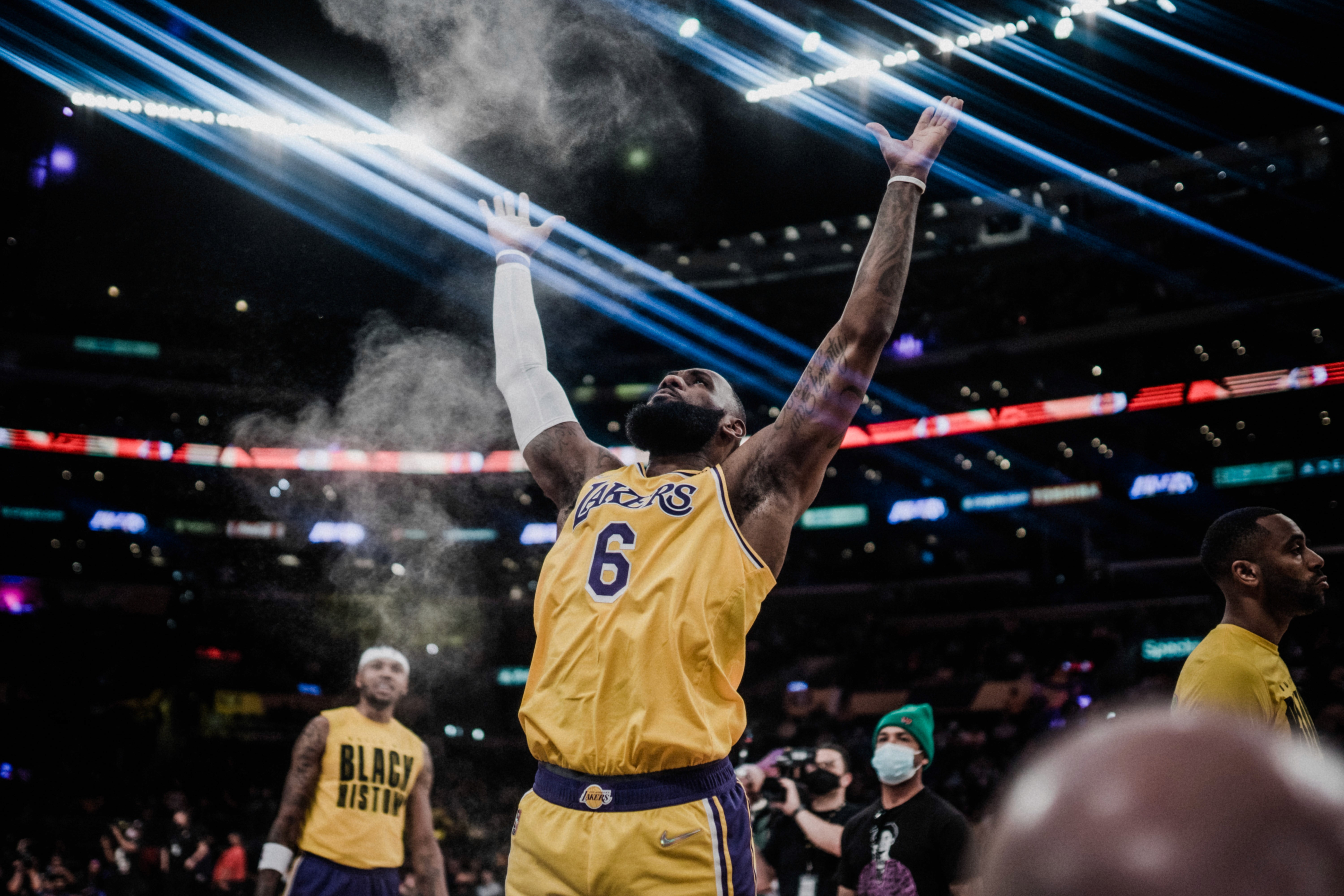
Whether the assignment involves weddings, families, newborns, corporate events, couples, or even fast-paced sports, the fastest path to a consistent, polished gallery is to color correct in Lightroom first—then apply the creative look. This workflow provides a practical, real-world method for building a clean, natural baseline so that color grading in Lightroom becomes faster, more predictable, and more skin-friendly.
By the end, the process delivers a step-by-step approach to white balance, exposure and contrast, HSL fine-tuning, and targeted local adjustments (brushes, gradients, AI masks) that adapts to widely varying lighting conditions. It also ensures that skin tones remain steady from noon sunlight to dance-floor LEDs, while enabling consistency across hundreds of RAW files without sacrificing individual style. When moving on to color grading Lightroom images—whether aiming for a warm romantic atmosphere or a moodier aesthetic—the foundation will already be rock-solid.
All editing is carried out entirely in Lightroom Classic, relying on its non-destructive RAW engine, batch tools, and modern masking.
Global foundation: step-by-step color correction
A clean baseline is the difference between effortless color grading in Lightroom later and hours of fighting skin tones and clipped highlights.
Camera profiles & a solid starting point
Before you color correct Lightroom images, choose a profile that renders skin naturally.
Adobe Color is lively and versatile—good for general use.
Adobe Portrait softens reds and magentas, usually kinder to skin.
Camera Matching mirrors your in-camera profiles, helpful for corporate or stage work where brand colors must be accurate.

In Lightroom Classic, set Preferences > Presets > Raw Defaults to “Camera Settings” (or your own “Camera Base” preset). Using consistent profiles makes later color grading with Lightroom more predictable, since contrast and color distributions begin closer to your target. If you often work under mixed LEDs, consider creating a custom DNG profile with a ColorChecker. This reduces baseline hue errors before you even touch Temp/Tint.

White balance & color casts
White balance is the master dial for believability. Correct one anchor frame per lighting setup—prep window, outdoor sun, shade, tungsten reception, LED stage or arena—then sync across similar shots.
Use the eyedropper tool (W) on a neutral target such as a gray suit, white dress, or plain wall. If nothing neutral exists, judge by skin; aim for whites that look neutral, not overly blue or orange.
Think about skin first: tungsten interiors often sit around 2800–3400K; shade may push 6500–7500K. If faces skew pink, nudge Tint slightly toward green; if they look sallow or greenish, move it slightly toward magenta. Always take tiny steps.
When working in mixed light, compromise. Choose a white balance that flatters faces—even if backgrounds shift a little. You can always correct spill locally.
Pro tip: Use Reference View to match skin tones by eye across scenes. For newborn and family shoots, a slightly warm balance works well. Corporate work calls for neutral. Sports depends on the venue, but don’t let reflections from the grass give faces a green cast.

Exposure, contrast & tone curve
Getting luminance right keeps texture intact in dresses, suits, and faces.
Adjust Exposure to place midtones (faces) bright but not chalky.
Use Highlights/Shadows for detail: lower highlights for bridal satin or stage spots; lift shadows for tux lapels and backlit cheeks.
Set Whites and Blacks using Alt/Option to find clipping points—snapping contrast without losing detail.
Add contrast gently. A subtle S-curve adds shape. If a color cast lives only in shadows, use the blue channel curve to correct instead of redoing WB.
Guidelines (flexible): Highlights –10 to –40; Shadows +10 to +35; Whites +5 to +20; Blacks –5 to –20; Contrast 0–+15 when paired with a curve.

Baseline sharpening & noise reduction
Sharpening is part of correction—it ensures technical clarity before creative grading. A safe global baseline for people work is:
Sharpening: Amount 30–60, Radius 0.7–1.2, Detail 10–25. Use Alt/Option while dragging Masking to limit sharpening to edges (lashes, hair, suits) and protect skin.
Noise reduction: Color 25 (Lightroom’s default), Luminance 0–20 depending on ISO. Heavy luminance NR makes skin waxy—better to reduce Texture locally on cheeks (–5) than to apply global Clarity.
When micro-contrast is clean, your lightroom colour grading can stay subtle; you won’t need excessive saturation or dramatic color shifts to rescue a mushy file.

Presence & color intensity
Presence and color intensity should support skin, not overwhelm it.
Texture enhances detail with fewer halos.
Clarity boosts midtone contrast but can emphasize pores. For people, keep both in the –5 to +10 range globally, and handle refinements locally.
Dehaze is useful for fog or lens flare but can cool shadows; +0 to +5 global is usually enough.
Vibrance vs Saturation: Vibrance is skin-aware; Saturation is blunt. A safe recipe is Vibrance +10 to +25, Saturation –5 to +5. If LEDs or jerseys scream, keep adjustments modest and plan to refine with HSL.

Lens corrections, defringe & geometry
Always enable Remove Chromatic Aberration and Enable Profile Corrections. Watch for over-brightened corners on wide-angles; dial back vignetting if you plan to add your own later. For strong magenta or green fringes (common with backlit veils or LED edges), use Defringe with the eyedropper directly on the problem rim. This is true color correction—it avoids desaturating the whole image.
Apply basic Transform (Vertical/Auto) for corporate stages or gym lines so horizons and screens look natural before you move on to color grading in Lightroom.
Local adjustments for precision
Global adjustments get you most of the way, but faces, color spill, and skies often need local refinements. Done well, these edits are seamless—which makes later colour grading in Lightroom both cleaner and more consistent.

Adjustment brush
Set your brush with a soft feather (70–100), moderate flow (30–70), and full density. Turn Auto Mask ON near hard edges (like a dress against a wall), and OFF when blending skin gradients.
Typical uses include lifting faces with a gentle exposure increase (+0.20 to +0.35) and slight shadow recovery (+10 to +20). Cool faces can be warmed with a tiny Temp shift (+100–250K), while texture (–5) softens pores. To neutralize color spill, add a Color Range over the affected area, then adjust Tint in the opposite direction (green spill: +3 to +10; magenta spill: –3 to –10) and slightly lower saturation. Saving whites—like bridal fabrics—often means lowering Highlights (–20 to –40) and Whites (–5 to –15), while adding Texture (+5 to +10) to preserve fine detail.
Linear gradients
Gradients are perfect for balancing large transitions such as skies, windows, or bright floors. An outdoor sky often needs a modest exposure drop (–0.3 to –0.7), highlight recovery (–20 to –50), and a slight cooling shift (–100 to –300K) to bring whites back toward believable blue. Windows flooding a room can be balanced by reducing exposure (–0.2 to –0.5) and Whites (–10), with a small warm-up on Temp (+100–200K) if the light feels too cold. Distracting floors or backgrounds can be darkened subtly to keep eyes on faces. You can also stack gradients and then subtract with a brush to carve precisely around subjects.
Radial gradients
Radials allow you to either spotlight a subject or create a soft vignette. For emphasis inside the circle, lift exposure slightly (+0.2 to +0.4), add a touch of contrast (+5), and perhaps a hint of warmth (+100K). Texture (+5) works well for hair and eyes. For an outer darkening effect, invert the radial and reduce exposure (–0.2 to –0.5) while pulling down Blacks (–5 to –15). This pushes attention toward the subject without looking forced.
AI-powered masks
Modern Lightroom tools like Select Subject, People, Sky, and Background give pro-level masks in seconds. For example:
Select Subject allows you to adjust the subject independently of the background.
Select People can isolate skin, eyes, lips, or hair. For skin, a gentle lift works well: Exposure +0.15 to +0.3, Shadows +10, Texture –5, Temp +100–200K if too cool, and Saturation –3 to –8 to control lips.
Select Sky is excellent for highlights and color balance—warm sunsets without warming skin.
Select Background makes it easy to cool or desaturate clutter so skin remains the hero.
Refinements come from subtracting brushes to avoid halos, adding Color Range for missed spill, or intersecting with Luminance Range to target specific brightness areas.
Consistent skin tones across different lighting
Skin is the hero of almost every gallery. When tones swing from cool-blue to orange-pink across a set, clients will notice the inconsistency, even if they can’t pinpoint why. The solution is to stabilize skin tones before you start color grading in Lightroom.
Scene-by-scene white balance
Each time the light changes, establish a new baseline on one anchor frame and sync it across the scene. Always prioritize faces over background accuracy—even if a wall looks slightly off, natural skin will matter more.
Reference view
Lightroom’s Reference View is invaluable. Pin your “golden skin” reference image on the left and match other frames on the right with small Temp/Tint adjustments. For tricky cases like purple uplights or green grass spill, this comparison keeps your corrections modest and consistent.
HSL/Color Mixer for skin
The HSL panel is where you fine-tune skin tones.
Orange Hue: Shift slightly toward yellow to reduce pinkness, or toward red to counter sallowness (±2–6).
Orange Saturation: Reduce moderately (–3 to –10) if faces look too intense.
Orange Luminance: Lift (+5 to +15) to brighten pale skin, or lower (–5 to –10) to add depth under harsh light.
Red Saturation/Hue: Dropping Saturation (–3 to –12) helps calm lips and ruddy noses.
Using the Targeted Adjustment Tool directly on cheeks or foreheads ensures your adjustments stay focused where they’re needed.
Mixed-lighting fixes
When a single frame includes multiple sources—say, window light mixed with tungsten—don’t chase perfection globally. Solve it locally. Use People > Skin, subtract with a Brush to split the face, then cool the warm side (Temp –200 to –400K, Tint –2) or warm the cool side (Temp +200 to +400K, Tint +2) until both halves match. For color spill from grass or LEDs, apply a Tint correction in the opposite direction and reduce Saturation if the cast persists.
Calibration & camera consistency
The Calibration panel can bring subtle but powerful improvements. Tiny moves here help keep skin consistent across an entire set or multiple camera bodies:
Red Primary: Shift slightly toward orange; reduce Saturation (–2 to –6) if lips and reds shout too loudly.
Blue Primary: A small nudge toward teal or reduced Saturation can soften cold shadows.
Green Primary: Move toward yellow to warm foliage, or toward blue to control neon greens.
For multi-camera setups, bake these adjustments into a Camera Base preset per body and lens combo so every import starts closer to your desired baseline.
Quality control pass
Before finalizing, do a five-minute QA sweep. In Grid or Survey view, lay out images from different scenes. If one group feels cooler or warmer, select and nudge Temp/Tint together. If skin looks too intense, reduce Orange Saturation slightly. When neon colors overpower faces, cut Vibrance by –5 or use targeted HSL tweaks. Editing in a neutral environment with a calibrated monitor helps you avoid drift.
A fast, repeatable editing order
Consistency in Lightroom comes not just from what you adjust, but from doing it in a clear sequence. A structured workflow saves time and keeps your eyes fresh.
Working environment & monitor
Accurate white balance depends heavily on your editing setup. Calibrate your display to D65 / 6500K, Gamma 2.2, and 100–120 cd/m². Disable features like True Tone or Night Shift, and keep room lighting neutral and steady. Even the Lightroom interface background can influence perception: very dark UIs tempt you to make images too bright or too warm. Stick to one environment for an entire job to avoid drift. A quick soft proof in sRGB can also help spot oversaturation before moving on to lightroom colour grading.
Presets as scene-based starting points
Instead of beginning from scratch every time, create baseline presets for typical lighting scenarios—Bright Sun, Open Shade, Indoor Tungsten, LED/Stage, Newborn/Soft Portrait. These should include white balance in the right neighborhood, tone recovery, a gentle curve, modest Vibrance, and minimal Saturation. Don’t save crops or masks in these presets. Apply them by scene or even on import so you’re always starting close to where you need to be.
Batch sync and copy/paste
Perfect one anchor image per scene, then sync the core adjustments—white balance, tone, curve, HSL, calibration, and sharpening. Leave local masks out at this stage; you can add them later, as AI masks will analyze each frame individually. For smaller sets of similar images, the Previous button is faster than opening the Sync panel.
Organize by scene and lighting
Edit in logical blocks instead of jumping randomly. Group images by capture time or location, correct one block end-to-end, and do a mini consistency pass before moving on. Creating a handful of reference edits—one per major lighting scenario—gives you benchmarks to match the rest of the gallery against.
Use automation wisely
Lightroom’s Auto Tone can provide a head start by placing exposure and dynamic range in a reasonable spot. But always refine white balance and Presence by eye. Adaptive and AI presets are also helpful: for example, using People-aware presets to lift faces gently or Sky-aware presets to recover highlights. This speeds repetitive work without creating chaos.
Shortcuts and micro-efficiencies
Enable Solo Mode so only one panel stays open at a time—less scrolling, more focus. Learn the keystrokes you’ll actually use: W for WB eyedropper, \ for Before/After, D/G/N for Develop/Grid/Survey, O for mask overlay, Q for Spot, R for Crop, and Y for Compare. Holding Alt/Option while dragging Whites or Blacks lets you see clipping directly. Save mask presets like “Face Lift Soft,” “Green Spill Fix,” or “Sky Save” for quick reuse. If you edit large volumes, controllers like Loupedeck or MIDI can speed slider adjustments.
The recommended order
To keep edits consistent and efficient, follow this sequence:
Cull > Apply scene preset (or Auto Tone) > Perfect one anchor > Sync globals > Add locals > QA for skin > Only then move to lightroom colour grading.
By the time you reach grading, your images already look natural and consistent, so creative moves stay lighter and more expressive.
Scale without losing the human eye
Even with a refined manual workflow, editing thousands of photos can feel overwhelming. This is where AI can step in—not to replace your vision, but to serve as a fast, reliable junior editor.
By training an AI profile on your own finished edits, you essentially teach it your preferences for exposure, white balance, contrast, curves, colors, and even typical local corrections. The assistant then applies that style across new shoots directly in Lightroom Classic, producing a first pass that’s both fast and consistent. For high-volume work—weddings, schools, sports, or corporate events—this can save enormous amounts of time. You still review the images, polish the few outliers, and add creative touches to the hero shots.
The key advantage is that the AI learns your correction habits. Because it understands how you normally keep skin tones neutral, exposure balanced, and contrast natural, its first pass comes very close to your preferred baseline. That helps you avoid the fatigue-driven drift that often sneaks in around image number 800.
Your role remains the same: you are the creative director. The AI simply clears away repetitive correction work so you can focus on storytelling, retouching, cropping, and eventually color grading with Lightroom to achieve your signature style.
FAQ (quick, practical answers)
What’s the difference between color correction and colour grading in Lightroom?
Color correction is about technical accuracy—neutralizing unwanted color casts, setting exposure and contrast, and making skin look believable. Colour grading in Lightroom is the creative step: shaping mood and atmosphere with HSL moves, the three-way grading wheels, or Calibration shifts. Always correct first, then grade.
Should I color correct before using Lightroom’s color grading tools?
Yes. If you start grading over an unbalanced base, you’ll end up fighting your own look. For example, applying a teal–orange grade over a too-warm white balance can make skin look neon. A neutral base ensures your grades are cleaner and more effective.
How far should I push Vibrance vs. Saturation for portraits?
Keep global Saturation subtle (around –5 to +5) and rely more on Vibrance (+10 to +25), which is skin-aware. For finer control, use HSL to adjust specific hues like Orange or Red. When in doubt, make adjustments locally with masks instead of globally.
Can I do all my color grading with Lightroom, or do I need Photoshop?
For most genres—weddings, families, newborns, corporate events, and sports—color grading in Lightroom is more than enough. HSL, Color Grading wheels, Calibration, and AI masks cover subtle, skin-safe looks at scale. Photoshop comes into play only when you need composites, heavy retouching, or pixel-level work.
How do I keep my exports consistent across platforms?
For online galleries, social media, and client previews, export in sRGB, JPEG quality 80–90, 2048–3000 px long edge, with Output Sharpening set to Screen (Standard). Always embed the profile to protect your grade, and double-check skin tones and whites on another device before delivery.
Conclusion
Correction makes your images look accurate and believable; grading makes them feel emotional and unmistakably yours. With the workflow above, you can color correct in Lightroom Classic quickly and consistently across weddings, families, newborns, corporate events, sports, and couple sessions. You’ve learned how to anchor white balance and exposure, recover detail without crushing skin, use HSL and Calibration for subtle global adjustments, and clean up faces, spill, and skies with local tools and AI masks.
You now have a repeatable, scene-based routine that scales seamlessly—from a one-hour family shoot to a 1,500-image wedding—while still leaving space for your creativity. And if volume is high, AI assistance can accelerate the first pass so you can spend more time on storytelling and polishing.
With this solid, believable baseline in place, you’re ready for the follow-up article: crafting your signature style with Lightroom color grading tools. There, we’ll explore subtle HSL recipes, the three-way Color Grading wheels for shadows, midtones, and highlights, and the Calibration panel for cohesive palettes—so your galleries don’t just look correct, they feel unmistakably yours.


Neurapix is a German startup based in Göttingen. Founded in 2021, the company has developed an artificial intelligence that learns individual editing styles and applies them directly within Adobe Lightroom. This allows photographers to edit large volumes of photos in their personal style in a fraction of the time—saving them hours of work.

Start with 1,000 free AI edits.
Copyright © 2026 Neurapix GmbH. All rights reserved.